
Employee Turnover Rate Benchmarks by Industry: 2025 to 2026 Data



Test Takers


Go looking for your industry's turnover benchmark and you will find four different numbers in about five minutes. One source says 10%. Another says 25%. A third quotes a monthly figure right next to an annual one and never mentions the difference.
So which one is right?
All of them, in a way. They are just counting different things.
Every number in this article comes from one place, the U.S. Bureau of Labor Statistics (BLS) and its Job Openings and Labor Turnover Survey (JOLTS), and every rate is measured the same way. Below you will find where your industry actually sits, how much of its turnover is people choosing to leave versus being let go, and how to turn that comparison into a decision. For the wider picture on causes and costs, start with our complete guide to employee turnover
One thing to know before the numbers: BLS reports turnover as a monthly rate, so the figures here look smaller than the annual rates most of us picture. About 3.3% of employees leave in a typical month. Across a year, that works out to roughly 40%.
First, some context on where the national picture stands. The chart below tracks the quit rate, the share of employees who leave voluntarily in a given month.
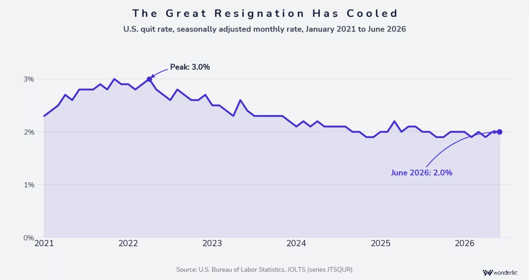
Quitting peaked at 3.0% a month in late 2021 and spring 2022, the stretch that became known as the Great Resignation. It fell for three straight years after that, and since early 2025 it has held steady between 1.9% and 2.0%, where it sat again in June 2026. Fewer people are choosing to leave than at almost any point in five years, which makes right now a good time to look hard at your own numbers.
Before you compare your rate to anything, it helps to know what the benchmark is actually counting. The most-cited turnover figures come from three kinds of sources, and they measure different events. That is the whole reason the numbers look irreconcilable.
The three main data sources, and what each measures
The practical rule is to compare like to like. If you track every separation, compare against total-separation data. If you only track resignations, compare against quit data. Mixing the two is the single most common reason a benchmark comparison misleads.
Monthly vs. annual rates, and how to convert
Some sources publish monthly rates and others publish annual ones, which makes the same labor market look wildly different depending on where you land. A 2.0% monthly rate is not low; multiply it across the year and it approaches 24%. When you hit a monthly figure, multiply by roughly 12 for a rough annual equivalent before comparing it to anything else. For the exact method, see how to calculate your turnover rate
Here is where each industry landed in 2025, the most recent complete year of BLS data. The monthly column is the sourced BLS figure. The annual column multiplies it by twelve, so the number reads the way most teams actually talk about turnover.
| Arts, entertainment & recreation | 6.1% | ~73% | High |
| Accommodation & food services | 5.5% | ~66% | High |
| Professional & business services | 4.6% | ~55% | High |
| Construction | 4.0% | ~48% | High |
| Transportation, warehousing & utilities | 4.0% | ~48% | High |
| Retail trade | 3.8% | ~46% | Average |
| Health care & social assistance | 2.9% | ~35% | Average |
| Information | 2.8% | ~34% | Average |
| Manufacturing | 2.4% | ~29% | Low |
| Finance & insurance | 2.1% | ~25% | Low |
| Government | 1.5% | ~18% | Low |
| All industries | 3.3% | ~40% | Baseline |
Source: U.S. Bureau of Labor Statistics, JOLTS, 2025 annual averages (Table 20, total separations), not seasonally adjusted. The monthly rate is the sourced BLS figure. Annual figures multiply the monthly rate by twelve and slightly overstate true annual turnover, because one position can turn over more than once a year. Benchmark rating is relative to the 3.3% all-industry monthly average: High is 4.0% and above, Average is 2.5% to 3.9%, Low is below 2.5%.
Industries with the highest turnover
Four industries sit well above the 3.3% all-industry average, and the reasons are not the same:
Industries with the lowest turnover
Government came in lowest of the industries here at about 18% a year (1.5% monthly), followed by finance and insurance at about 25% (2.1% monthly) and manufacturing at about 29% (2.4% monthly). Worth knowing: inside government, state and local government and state and local education both run lower still at 1.4%, so the combined figure understates how stable parts of the public sector are.
But low turnover is not automatically a win. When almost nobody leaves, promotion paths back up and teams can go years without new perspectives. The better question is not whether your rate is low, but who is leaving.
If your industry runs hot, that usually says more about how the work is structured than about how you are managing it. Four patterns explain most of the spread:
Almost every benchmark gives you one number. That is the least useful version of the data, and separating it is the most valuable thing this article can hand you.
BLS tracks the two halves separately, which is exactly why it is worth using. Across the economy in 2025, quits averaged 2.0% a month against layoffs and discharges of 1.1%. So people left voluntarily at nearly twice the rate they were let go. That ratio does not hold everywhere, though.

As you can see in the chart above, two industries break the pattern. In construction, layoffs and discharges (2.1%) run higher than quits (1.8%). In arts, entertainment, and recreation the gap is wider still, 3.8% against 2.2%. Both fit seasonal and project-based staffing rather than people walking away. Information is the one industry where the two run exactly level, at 1.3% each.
What the split tells you
The two halves usually call for different responses. Voluntary exits are the ones most open to influence, through retention, development, and manager quality. Involuntary exits point more toward workforce planning and hiring accuracy. Roll them into one number and it is easy to pull the wrong lever.
Picture two organizations sitting the same distance above their industry benchmark. One is losing people who chose to leave. The other is letting people go. Same gap on the dashboard. Almost nothing about the response would be the same.
Things to focus on:
Where the most preventable turnover sits
Preventability is less about having the highest quit rate and more about how far quits outrun layoffs, because that gap is roughly the share of turnover that came down to someone's decision rather than yours.
Accommodation and food services leads on both counts, with quits at 4.2% against layoffs of 1.1%, close to four to one. Health care and social assistance shows the same shape at a lower level, 2.0% against 0.7%. Retail trade runs 2.6% against 1.1%. Professional and business services is the mixed case: a high quit rate at 2.3%, but a layoff rate of 2.0%, one of the highest here, so a real share of that turnover will not respond to retention work at all.
An industry benchmark is a starting point, not a conclusion. Inside any industry, turnover varies a lot by role and level. If your workforce leans toward one of the higher-churn roles, the industry average will make your situation look better than it is.
Health care is the clearest example. A hospital administrator and a registered nurse work in genuinely different labor markets, so a single health care turnover rate blends two very different realities. The same goes for hourly staff versus store managers in retail, or individual contributors versus senior leaders in technology roles.
So before you decide what to do, find out which roles are actually driving your number.
A benchmark on its own is just a score. These four steps turn it into something you can act on.

On step 3, exit and stay interviews are usually the fastest way to get an honest answer about what is driving the gap. See exit interviews
Wherever your diagnosis lands, it usually points to one of two things: who you are hiring, or how you are developing the people already on the team. Which one matters more depends on what your numbers say, not on what industry you are in.
When the losses cluster early, in the first few months or the first year, fit is worth examining first. The role may have asked for a pace, a working style, or a kind of motivation that was never really there, and onboarding alone rarely closes that gap.
When people leave later, after two or three years, the driver is more often growth. Employees who cannot see a path forward with you will eventually find one somewhere else.
Most organizations find their turnover is not one problem, and the two work together. Better-fitting hires tend to develop faster, and stronger development keeps good hires longer. Wonderlic supports that full talent lifecycle, from selection through development, whatever industry you are in.
Most organizations treat the benchmark comparison as the finish line. It works better as the starting line. Knowing you sit above your industry average tells you something is worth looking into. Knowing whether that gap is voluntary or involuntary, spread evenly or concentrated in a few roles, is what actually points you toward a fix.
The organizations that move their numbers are rarely the ones that found a friendlier benchmark. They are the ones that asked better questions about the number they already had. For the full framework, including retention strategies that hold up, see our complete guide to employee turnover
What is the average employee turnover rate by industry?
It varies widely. In the most recent full year of BLS data, total turnover ranged from about 1.5% of employees per month in government (roughly 18% a year) up to 5.5% per month in accommodation and food services (about 66%) and 6.1% in arts, entertainment, and recreation (about 73%). The all-industry average is about 3.3% per month, roughly 40% a year. Before comparing any figure to your own, check whether it counts only quits or all separations, and whether it is monthly or annual.
What is a good employee turnover rate?
There is no universal answer, because a rate only means something inside your industry. The same number can be a good result in hospitality and a warning sign in government. More useful than any single figure: compare within your industry using one consistent source, separate voluntary from involuntary, and watch your trend over time rather than reacting to one snapshot.
Which industry has the highest employee turnover rate?
Arts, entertainment, and recreation, at about 6.1% of employees per month, roughly 73% a year. Most of that is involuntary, which fits a category built around seasonal and project-based work. Accommodation and food services follows at 5.5%, where the pattern reverses and most of the turnover is people choosing to leave.
Which industry has the lowest employee turnover rate?
Of the industries in this article, government is lowest at about 1.5% per month, roughly 18% a year, followed by finance and insurance at 2.1% and manufacturing at 2.4%. Within government, state and local government and state and local education run lower still, at 1.4%.
Why is hospitality employee turnover so high?
Most of it is voluntary. Quits in accommodation and food services run about 4.2% a month against layoffs of 1.1%. The reasons usually given are limited wage growth, physically demanding work, irregular hours, and how easy it is to move to a similar job elsewhere. Seasonal demand adds to it.
How does voluntary turnover differ from involuntary turnover by industry?
Voluntary turnover means quits, where the employee initiates the exit. Involuntary means layoffs and discharges, initiated by the employer. BLS tracks them separately. Across the economy quits run about 2.0% a month against 1.1% for layoffs, but the balance shifts by industry, and in construction and in arts, entertainment, and recreation involuntary exits actually exceed voluntary ones.
How do I use industry turnover benchmarks to improve retention?
Work out your own rate consistently, tracking voluntary and involuntary separately. Compare within your industry rather than to a national average. If you are running above it, look at which roles and seniority levels are driving the gap and which type of exit is behind it. That tells you whether you are looking at a hiring question, a management question, or a development question.
Every figure comes from the U.S. Bureau of Labor Statistics. Re-verified against the primary tables on August 4, 2026, including the June 2026 release published that morning.